By 2Fifty Designs – September 2026
5 Signs Your Contractor Website Is Costing You Customers
Your website might not be actively turning customers away — but it could be making it harder for them to choose your business.
For contractors, trades and local service businesses, your website is often one of the first places potential customers go when they’re deciding who to contact. They might find you through Google, see your truck around town or hear about you from a friend. Either way, there’s a good chance they’ll look you up before making the call.
And when they do, they’re comparing what they see with the other options available.
An outdated design, confusing information or difficult contact process can create just enough doubt for someone to move on to the next business.
Here are five signs your website could be costing you customers.
01. Your Website Looks Outdated
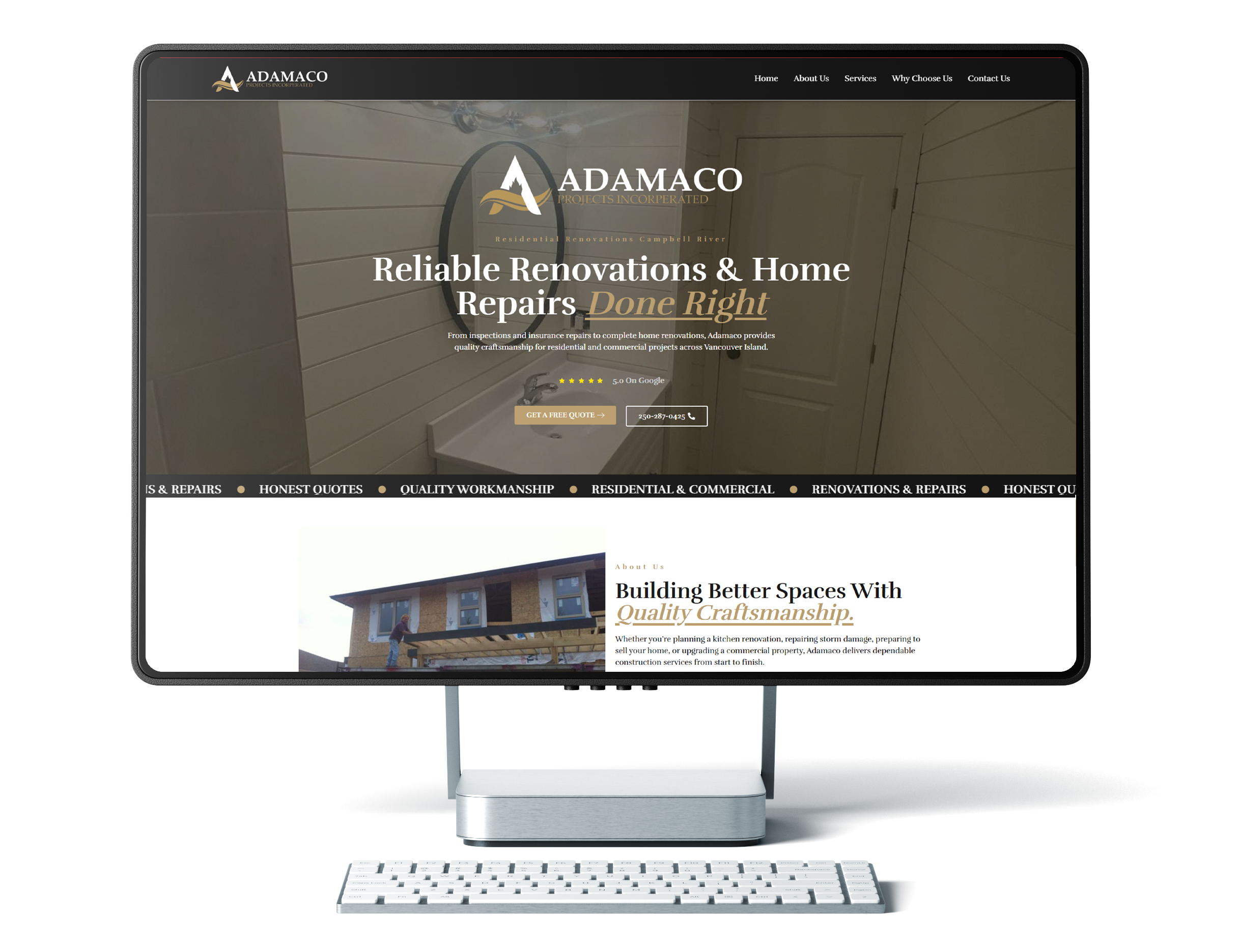
First impressions happen quickly. You can do incredible work and have years of experience, but if your website looks like it hasn’t been updated in a decade, that can affect how potential customers perceive your business. Fair or not, people make assumptions based on what they see online. An outdated website can make someone wonder:
Is this business still active?
Will they be professional to work with?
Do they pay attention to the details?
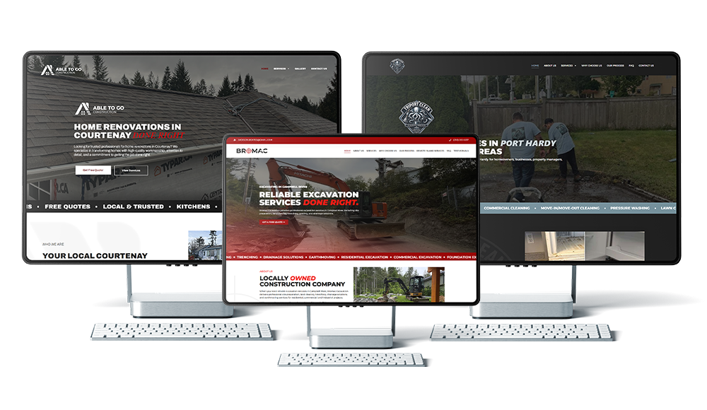
Your website doesn’t need flashy animations or the latest design trend. In fact, keeping things simple is often better. But it should feel clean, current and representative of the quality of work your business provides. That means modern typography, quality imagery, consistent branding, easy navigation and enough breathing room that visitors aren’t overwhelmed with information. Think about your website the same way you’d think about your truck, equipment or job site. It represents your business. If you take pride in the work you do, your website should reflect that.
02. Your Website Is Frustrating to Use on a Phone
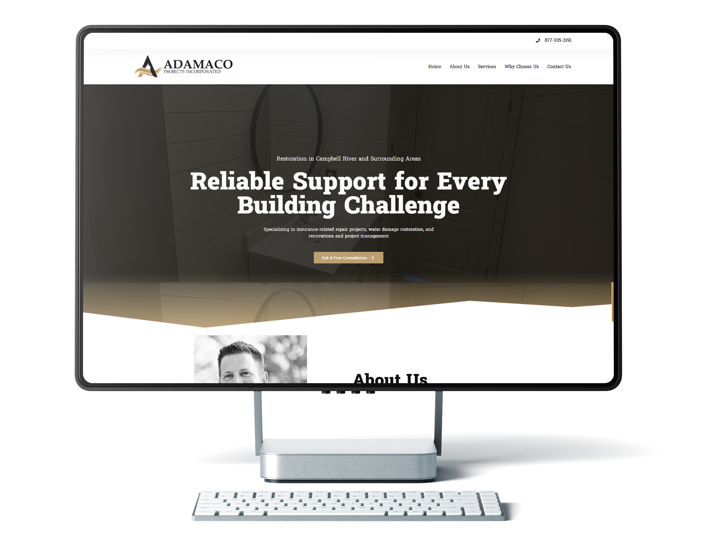
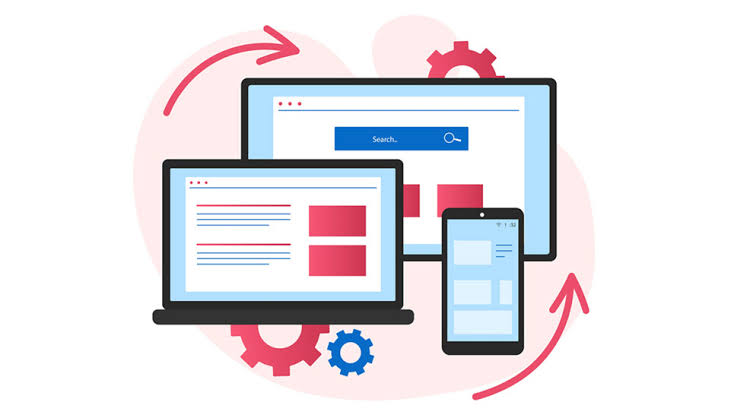
Your desktop website isn’t the only version that matters. Pull out your phone and visit your own website. Try to use it like a potential customer would. Can you easily read the text? Can you navigate between pages? Can you find your phone number? Can you tap it to call? Can you request a quote without zooming in or fighting with the form? If any of those things are difficult, there’s a good chance potential customers are having the same experience.
A website technically loading on a phone doesn’t necessarily mean it’s providing a good mobile experience. Buttons should be easy to tap. Text should be readable. Navigation should be simple. Images shouldn’t take forever to load. Contact information should be immediately accessible. This is especially important for contractors and local service businesses. Someone searching for an excavator, roofer, landscaper or HVAC company may be doing it from their phone — not sitting at a desk. If your website makes getting in touch difficult, the next contractor is only a Google search away.
03. Customers Can't Quickly Tell What You Do
Don’t make people search for the answer.One of the most common website mistakes is trying so hard to sound impressive that the most important information gets lost. Imagine landing on a contractor’s website and seeing:
“Building Better. Together.”
It sounds nice.
But what does the company actually do?
Are they a home builder? Excavation company? Roofer? Renovation contractor?
Compare that with:
Home Renovations & General Contracting in the Comox Valley
Helping homeowners transform their spaces with quality renovations, additions and construction services.
Request a Quote →
There’s no guessing.
A potential customer should be able to land on your homepage and quickly understand:
What you do.
Where you work.
Who you work with.
How they can contact you.
Your website can explain the finer details as someone continues scrolling.
The first few seconds are about clarity.
If visitors have to dig through your website just to determine whether you provide the service they’re looking for, you’re creating unnecessary friction before they’ve even had a chance to consider hiring you.
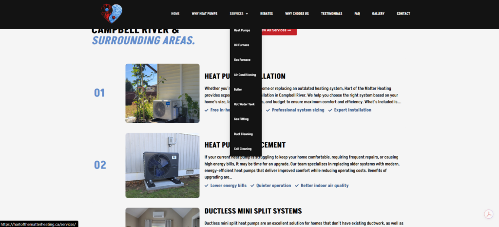
04. You're Not Showing Your Best Work
Don’t just tell people you’re good. Show them. Imagine you’re choosing between two landscaping companies.
The first website says:
“We provide high-quality landscaping services.”
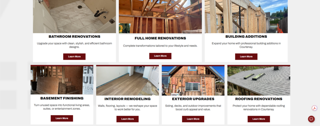
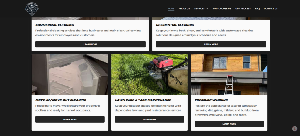
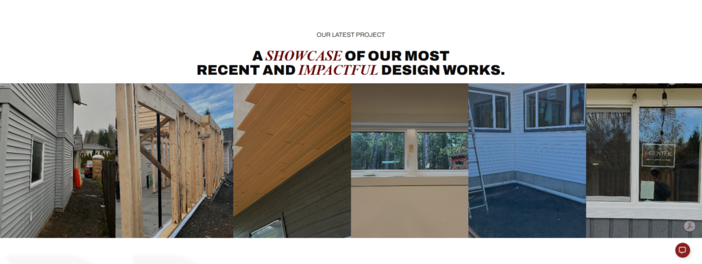
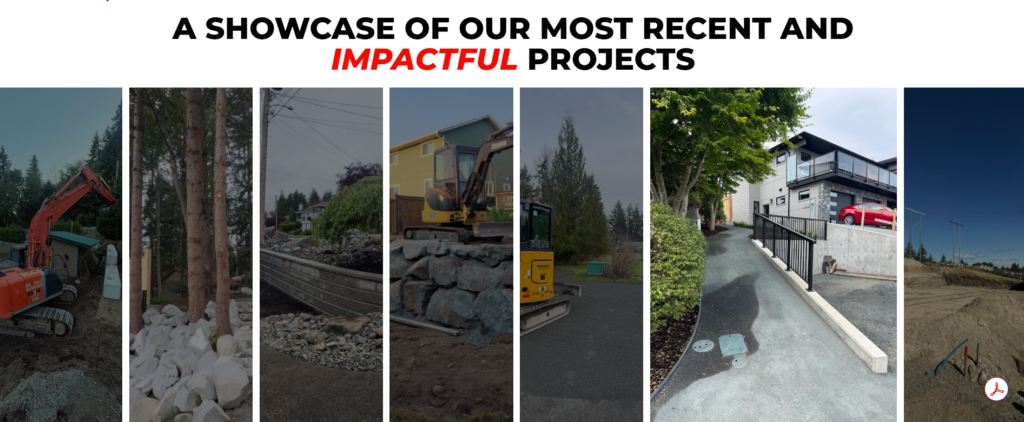
The second shows beautiful photos of completed landscapes, before-and-after transformations and examples of recent projects. Which one gives you more confidence? For contractors, your completed work is one of the strongest marketing assets you have. Yet many contractor websites either don’t show enough of it, rely heavily on stock photography or have a gallery that hasn’t been updated in years.
Your website should give potential customers an opportunity to see what you’re capable of.
That could include:
Completed project galleries
Before-and-after photos
Individual project pages
Recent work
Photos throughout your service pages
Short project descriptions
You don’t necessarily need professional photography for every job.
Modern phones can take excellent photos. The important thing is developing the habit of documenting your work. Take a few photos before you start. Take photos throughout the project. Take several when you’re finished. Over time, you’ll build a library of real content that can be used across your website, Google Business Profile and social media. Your previous work can help sell your next project. Let people see it.
05. It's Too Difficult to Request a Quote
Don’t make someone work to become your customer. Someone has looked through your services. They’ve seen your projects. They like what they see. They’re ready to contact you. Now what?
If they have to scroll to the bottom of the website, find a tiny phone number, navigate to a separate contact page and fill out a 15-question form, you’re making the most important action on your website unnecessarily difficult.
For most contractor websites, requesting a quote should be one of the easiest things to do.
Consider having:
-
A Request a Quote button in your navigation
-
Click-to-call phone numbers on mobile
-
Calls-to-action throughout important pages
-
A simple contact form
-
A clear CTA at the bottom of service pages
-
Contact information in your footer
And keep your forms reasonable. You need enough information to understand what the customer is looking for — but you don’t necessarily need every detail about their project before having the first conversation. Ask for the essentials.
Name.
Phone or email.
Location.
Service needed.
A short description of the project.
You can gather the rest later.
Every unnecessary step between someone deciding they’re interested and actually contacting you is another opportunity for them to leave.
Make the next step obvious.